
Firstly, you need to decide on a unique identifying name for your collapsing element. The name can use numbers, letters (in upper or lower case) and underscores. Using any other characters in the identifier may cause problems.
Here, we'll call it MyELEMENT.
A collapsible element consists of two parts - a control (usually a button) to control the expanding and collapsing behavior, and the actual content to be expanded and collapsed.
A collapse control looks like this:
<a href="#top" onclick="return toggle_collapse('MyELEMENT')"><img
    id="collapseimg_MyELEMENT"
    src="$stylevar[imgdir_button]/collapse_thead$vbcollapse[collapseimg_MyELEMENT].gif"
alt="" border="0" /></a>Note:
In the example, the image being used for the collapse control has a prefix of collapse_thead. This is because the image is designed to blend into the background color of elements using the '.thead' CSS class.
There are also images to blend with the '.tcat' and '.alt1' / '.alt2' CSS classes, with prefixes of collapse_tcat and collapse_alt respectively.
There are also images to blend with the '.tcat' and '.alt1' / '.alt2' CSS classes, with prefixes of collapse_tcat and collapse_alt respectively.
A very simple example of a collapsible element container for MyELEMENT looks like this:
<div id="collapseobj_MyELEMENT" style="$vbcollapse[collapseobj_MyELEMENT]">
    <!-- any HTML here will be hidden when the
    'MyELEMENT' collapse control is clicked -->
</div>The following example shows a complete collapsing element.
<div class="tborder">
    <div class="tcat" style="padding:4px">
        <a href="#top" style="float:$stylevar[right]"
            onclick="return toggle_collapse('MyELEMENT')"><img
            id="collapseimg_MyELEMENT"
            src="$stylevar[imgdir_button]/collapse_tcat$vbcollapse[collapseimg_MyELEMENT].gif"
            alt="" border="0" /></a>
        Click this button to show/hide the content below:
    </div>
    <div id="collapseobj_MyELEMENT" style="$vbcollapse[collapseobj_MyELEMENT]">
        <div class="alt1" style="padding:8px">
            <p><strong>Hello!</strong> Welcome, $bbuserinfo[username].</p>
            <p>If you would like to check your private messages,
            <a href="private.php?$session[sessionurl]">Click here</a>.</p>
        </div>
    </div>
</div>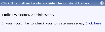

Because <p> can't enclose <div>, I just substituted <div> for <span>, making it:
<span id="collapseobj_MyELEMENT" style="$vbcollapse[collapseobj_MyELEMENT]">foo</span>
[code]id="collapseimg_MyELEMENT"[/code]
to this:
[code]id="collapsecel_MyELEMENT"[/code]
as well as change the img tag to a span or div.