While any valid HTML can be inserted into the
<div> element that defines the reaches of a vBMenu popup, there are a few systems and standards in place to help you achieve a consistent look and feel for your menus.
vBMenu popups usually take the form of a
<table> with individual rows for separate options on the menu, with a single hyperlink inside each cell, which points to the desired page.
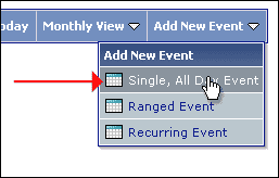
As you can see from the image above, each row switches its style when the mouse pointer hovers over it. This mouse-over effect is achieved automatically with the vBMenu system, and makes use of the
Popup Menu Option Row (
.vbmenu_option) CSS class and its partner, the
Popup Menu Highlighted Option (
.vbmenu_hilite) CSS class.
An example of content for a vBMenu popup element might look like this:
<table cellpadding="4" cellspacing="1" border="0">
<tr>
    <td class="thead">This is my example vBMenu</td>
</tr>
<tr>
    <td class="vbmenu_option"><a href="index.php">Home Page</a></td>
</tr>
<tr>
    <td class="vbmenu_option"><a href="usercp.php">User CP</a></td>
</tr>
</table>
If for whatever reason you want to
prevent the style switching behavior of elements using the
.vbmenu_option CSS class, you can do so by adding a
title attribute with a value of
nohilite to the appropriate element, like this:
<tr>
    <td class="vbmenu_option" title="nohilite">
        This row will not hilight on mouse-over.
    </td>
</tr>